
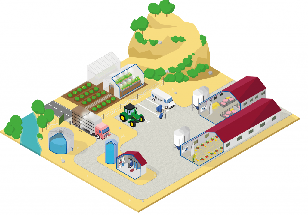
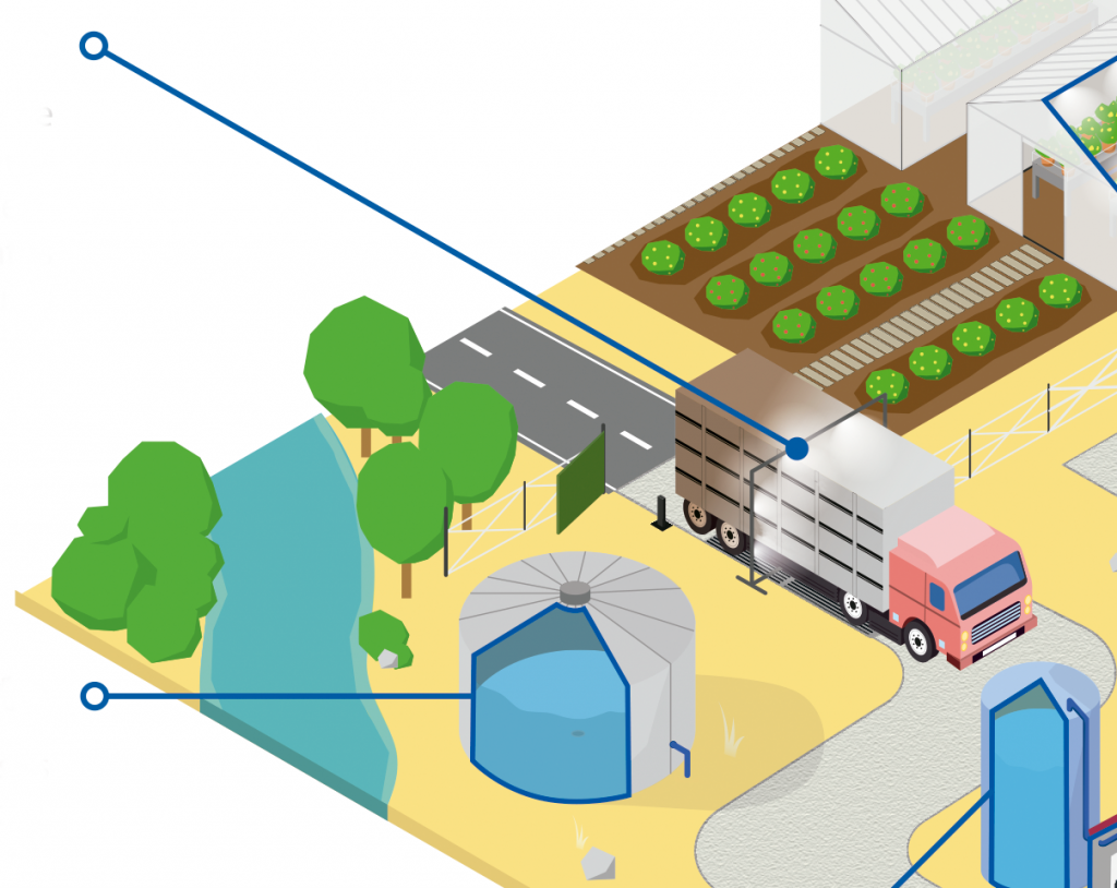

An infographic is a tool for transmitting information that has great communicative power. It is the epitome of the phrase:
“a picture is worth a thousand words”.
In a dynamic and fun way, with a double-page image and using lines that communicate images through text, we begin to explain what our fields of expertise are.
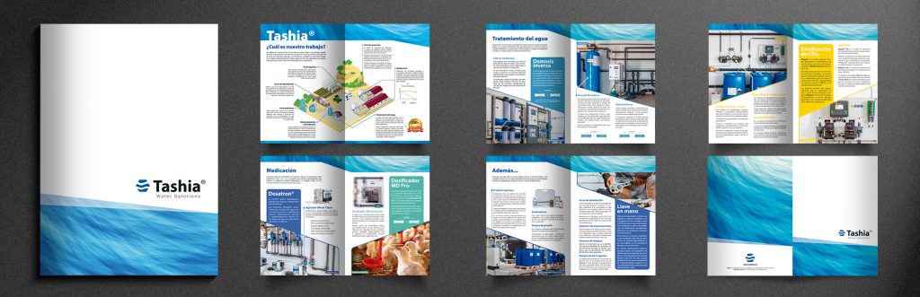
The text throughout the leaflet is written in simple language and its purpose is to provide information, expanding on or clarifying those details of greatest interest to anyone who needs them or who is simply curious.
For the inner layout of the leaflet, a design has been used that aims to simplify the association of product types and services by means of images and colors, in order to make it easier to understand and remember.
For example, the color blue has been used for the section that comprises equipment for water treatment by means of chemical processes. Yellow, on the other hand, has been used for systems specifically for the treatment of water by means of bacteriological processes, such as processes using chlorine dioxide, which, in its resulting form, produces a product that is yellow in color.
The use of harmonious color combinations makes the reading experience as satisfying as possible and gives a pleasant feeling of well-being.
| Cookie | Duration | Description |
|---|---|---|
| cookielawinfo-checkbox-analytics | 11 months | This cookie is set by the GDPR Cookie Consent plugin. The cookie is used to store the user's consent for cookies from the "Analytics" category. |
| cookielawinfo-checkbox-functional | 11 months | The cookie is set by the GDPR cookie consent to register user consent for cookies in the "Functional" category. |
| cookielawinfo-checkbox-necessary | 11 months | This cookie is set by the GDPR Cookie Consent plugin. Cookies are used to store user consent for cookies in the "Necessary" category. |
| cookielawinfo-checkbox-others | 11 months | This cookie is set by the GDPR Cookie Consent plugin. The cookie is used to store the user's consent for cookies from the "Other" category. |
| cookielawinfo-checkbox-performance | 11 months | This cookie is set by the GDPR Cookie Consent plugin. The cookie is used to store the user's consent for cookies in the "Performance" category. |
| viewed_cookie_policy | 11 months | The cookie is set by the GDPR Cookie Consent plugin and is used to store whether or not the user has consented to the use of cookies. It does not store any personal data. |
| Cookie | Duration | Description |
|---|---|---|
| _ga | 2 years | The _ga cookie, set by Google Analytics, calculates visitor, session and campaign data and also tracks site usage for site analytics reporting. The cookie stores information anonymously and assigns a randomly generated number to recognize unique visitors. |
| _gat | 1 minute | This cookie is set by Google Universal Analytics to restrict the rate of requests and thus limit data collection on high traffic sites. |
| _gid | 1 day | Set by Google Analytics, the _gid cookie stores information about how visitors use a website, while creating an analytical report of the site's performance. Some of the data collected are the number of visitors, their origin and the pages they visit anonymously. |